The look, feel and
soul of Pure Good.
Our visual identity reflects who we are: fresh, grounded and intentional. These guidelines ensure consistency across every touchpoint -- from packaging to digital.
Our logo.
The primary logo should be applied across the majority of use cases. The secondary wordmark may be used alone, but less frequently.
 Primary useWhite variantBlack on green
Exclusion zone
The logo must always have a clear space equal to the width of the Pure Good “P” on all sides. The distance guide is a perfect square measurement taken from the gap between the words “Pure” and “Good”.
Logo don'ts
- Do not stretch, skew or distort the logo in any way
- Do not remove or change placement of any logo components
- Do not use non-standard colours or recolour the logo
- Do not use non-standard typefaces
- Do not obscure or cover the logo with text or images
- Do not use shadows, glows or special effects on the logo
- Do not let the logo float over contrasting colours or lines
- Do not turn the logo on its side
- Do not use the green logo on a photo -- use black or white for visibility
Brand colour palette.
Inspired by the natural greens and earthy tones of fresh produce, our palette communicates vitality and trustworthiness.
Primary palette
Secondary palette
Brand typefaces.
Our logo is set in Brandon Grotesque Bold, uppercase. Supporting typefaces are selected for clarity and warmth across all channels.
External use
For all professional marketing and communications material.
Internal use
For internal communication with free, licence-free fonts.
Photography style.
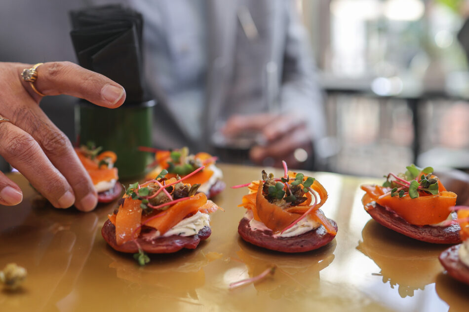
Our ideal photography style is lifestyle -- curated to look natural and unstaged, but clean, fresh and vibrant. Authentic, high-quality photography is a powerful way to communicate the Pure Good ethos.


Bringing it all together.
From stationery to packaging to team uniforms -- the Pure Good identity is designed to be consistent, recognisable and grounded in every application.
Stationery
Business cards, letterheads and branded collateral.
Packaging
Compostable containers, labels and bags -- always on brand.
Uniforms
Team apparel that reflects Pure Good professionalism and warmth.